17 Stunning Earthy Kitchen Color Schemes for a Cozy, Modern Look
Imagine walking into a kitchen that feels calm, grounded, and effortlessly beautiful.
Earthy kitchen color schemes transform ordinary cooking spaces into warm sanctuaries that blend natural beauty with timeless style.
From soft terracotta to deep forest greens, these organic palettes create environments that nurture both body and soul.
I’ve noticed that homeowners today crave spaces that feel less sterile and more connected to nature.
The right color combination can turn your kitchen into a place where mornings feel peaceful and gatherings feel intimate.
Whether you’re planning a full renovation or simply refreshing your walls, these carefully curated color palettes offer inspiration that works for every design preference and budget.
17 Stunning Earthy Kitchen Color Schemes
In this article, you’ll discover 17 beautiful earth-inspired schemes that blend warm neutrals, organic tones, and natural hues to create kitchens that truly feel like home.
Terracotta and Cream
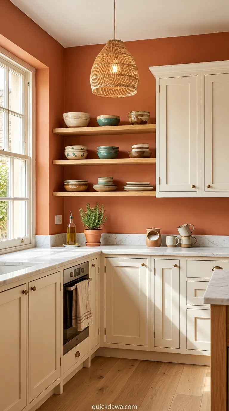
Terracotta walls paired with creamy white cabinetry create an instant feeling of Mediterranean warmth in any kitchen. This combination works beautifully because the rich clay tones ground the space while the soft cream keeps everything feeling light and airy.
I’ve seen this palette transform dated kitchens into spaces that feel collected and intentional. The terracotta brings personality without overwhelming the senses, and when you add natural wood shelving or woven basket storage, the entire room comes alive with texture and depth that photographs beautifully and functions even better.
Sage Green and Oak
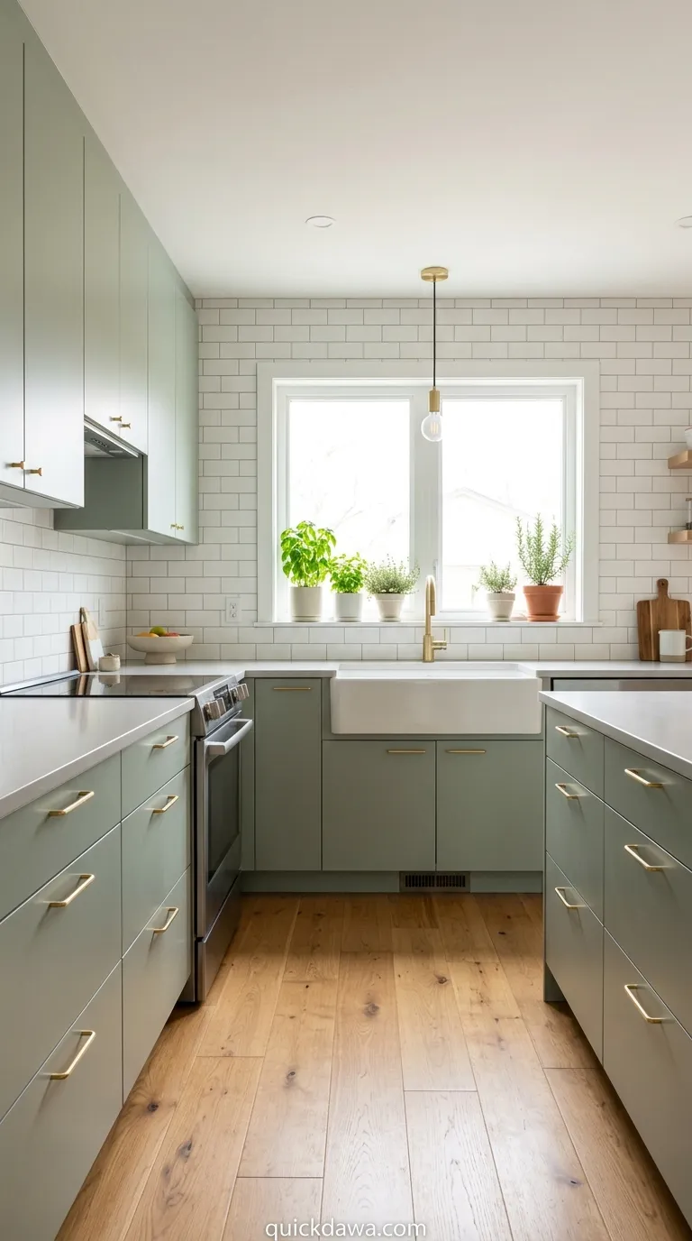
Soft sage cabinetry against honey-toned oak flooring establishes a fresh yet grounded aesthetic that never feels trendy or temporary. The muted green brings a botanical quality indoors while the warm wood grain anchors everything with organic authenticity.
In my experience, this scheme works particularly well in kitchens with abundant natural light. The sage responds beautifully to changing daylight throughout the day, sometimes appearing more gray, sometimes more green, creating a dynamic visual experience that keeps the space feeling alive and connected to the outdoors.
Warm Taupe and Stone
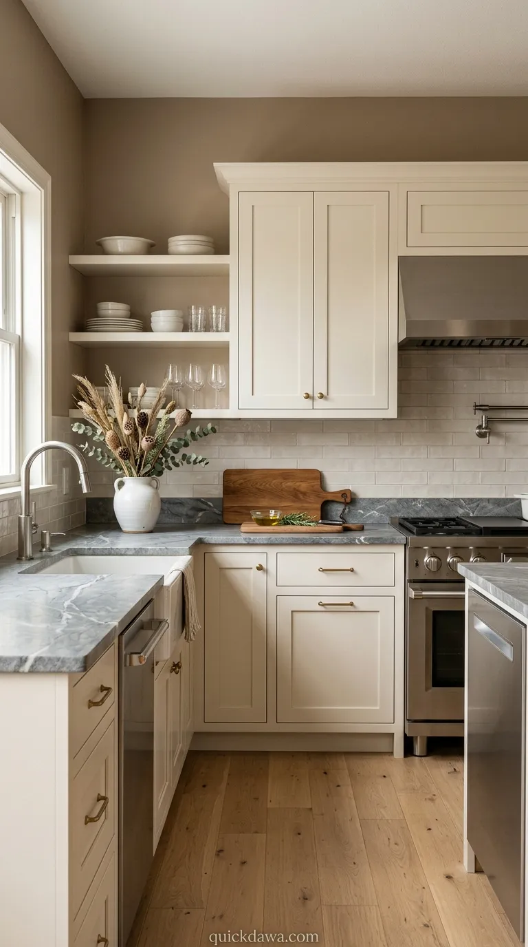
Taupe-painted walls combined with stone countertops deliver sophistication without coldness, creating kitchens that feel refined yet approachable. This neutral foundation allows you to layer in personality through textiles, artwork, and decorative objects while maintaining visual calm.
From what I’ve observed, taupe succeeds where beige sometimes fails because it contains more complexity and depth. When paired with natural stone surfaces in similar tonal ranges, the result feels curated and expensive, proving that earth-inspired palettes don’t require bold color to make a significant impact on your home’s atmosphere.
Clay Red and Ivory
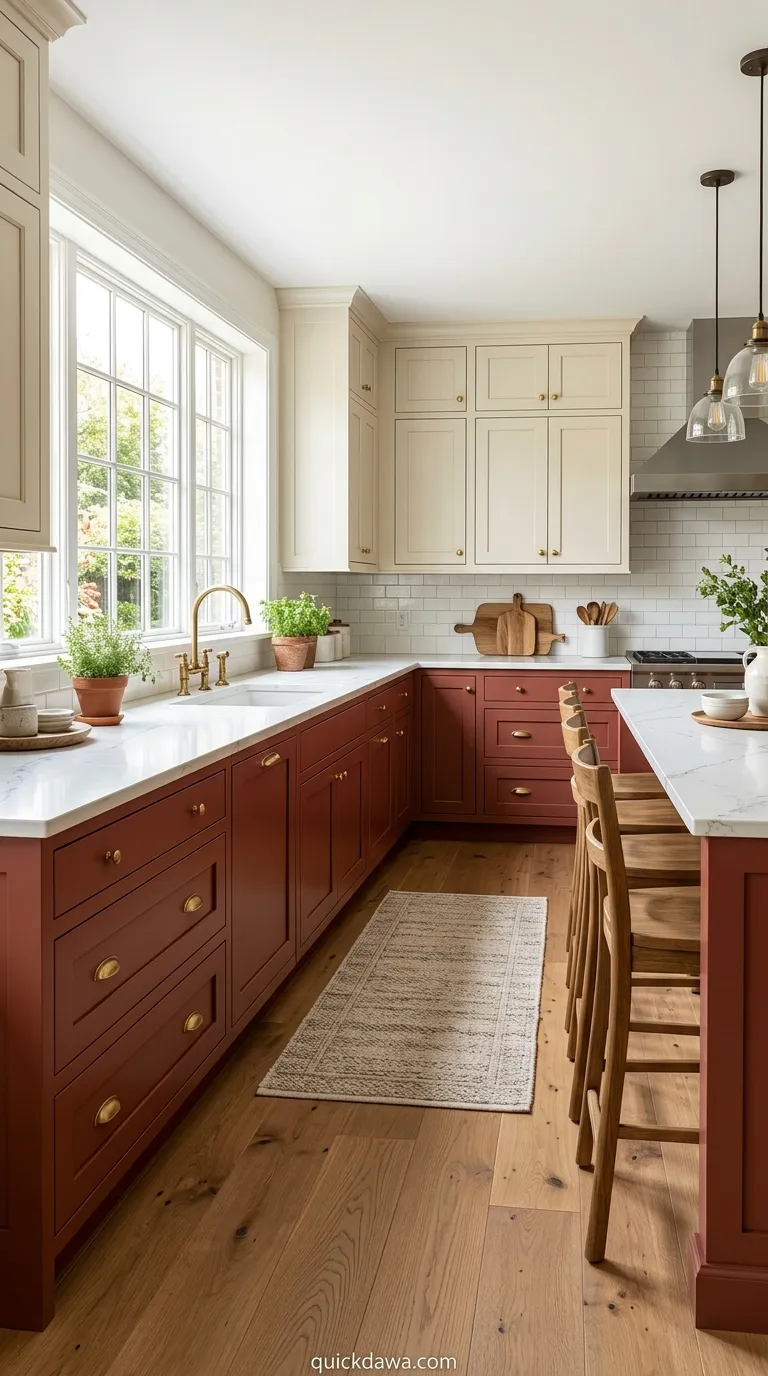
Deep clay red lower cabinets paired with ivory uppers create dramatic contrast while maintaining earthy warmth throughout the kitchen. This two-toned approach adds architectural interest and prevents the space from feeling too monochromatic or visually flat.
I’ve found that this color distribution works best when the darker shade anchors the bottom half of the room. The ivory upper cabinets draw the eye upward, making ceilings appear higher while the rich red grounds the working areas where you prepare meals and gather with family.
Olive and Natural Linen
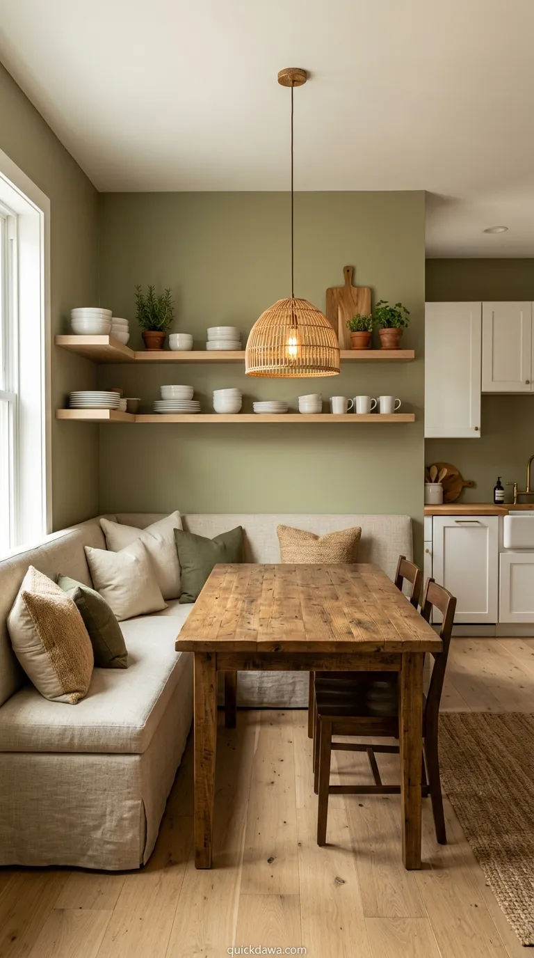
Olive green walls wrapped around natural linen-covered seating establish a sophisticated organic color scheme that feels both modern and timeless. The muted green provides just enough color interest without competing with your cooking activities or food presentation.
This combination photographs exceptionally well for those who love sharing their spaces on social platforms. The textural quality of linen against the depth of olive creates visual layers that feel intentional and thoughtfully designed, proving that earthy tones can be just as striking as bolder palettes.
Warm Gray and Walnut
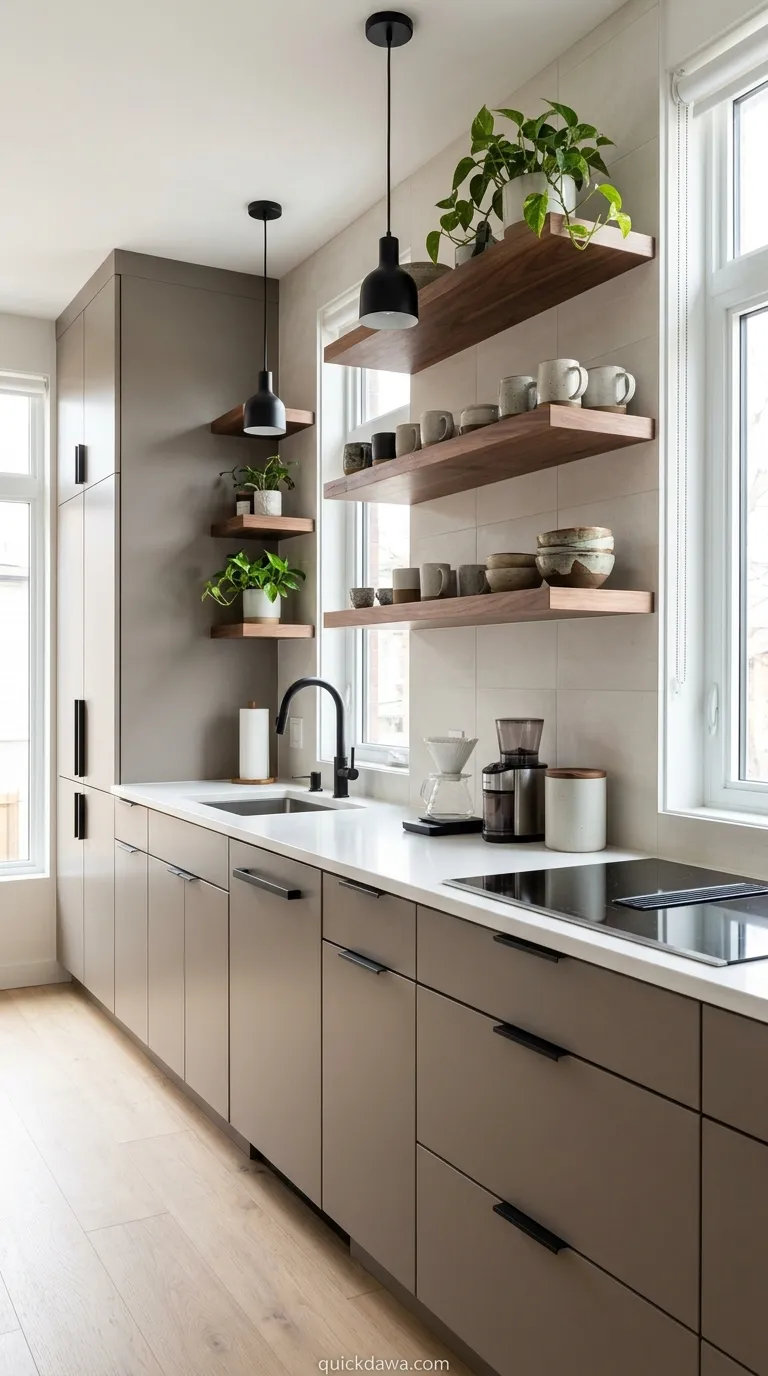
Warm gray cabinetry paired with rich walnut accents delivers contemporary style without sacrificing the comfort that natural wood tones provide. This palette works beautifully in urban settings where you want a connection to nature without going full rustic.
I’ve experimented with this combination in various lighting conditions, and it consistently performs well. The gray provides a neutral backdrop that won’t compete with your dishes or decor, while the walnut introduces warmth and organic character that prevents the space from feeling cold or institutional.
Sandstone and White Oak
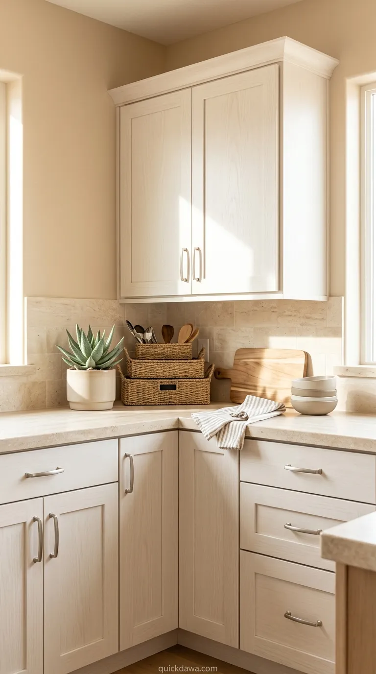
Sandstone-colored walls combined with white oak cabinetry create a sun-washed aesthetic that brings desert-inspired tranquility into everyday cooking spaces. This palette feels particularly grounding because both colors exist abundantly in natural landscapes and rock formations.
The beauty of this scheme lies in its versatility. You can introduce terracotta pots, woven textiles, or ceramic dishware in deeper earth tones, and everything harmonizes effortlessly because the foundation remains neutral and welcoming, allowing your personality to shine through layered styling choices.
Mushroom Brown and Cream
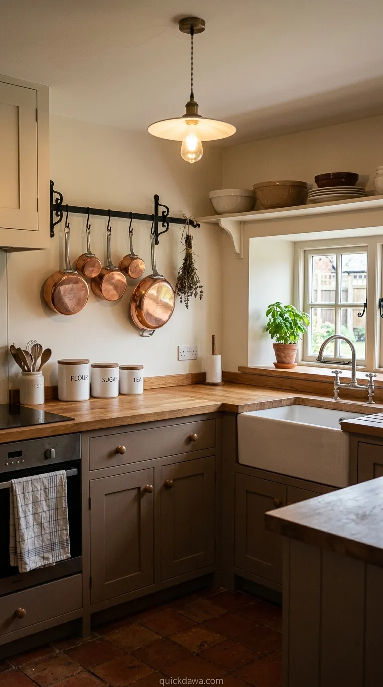
Mushroom brown lower cabinets paired with cream-painted walls establish a cozy, enveloping atmosphere perfect for kitchens where families gather throughout the day. This warm neutral palette feels inherently comfortable without appearing dated or overly casual.
In my experience, brown tones work best when they contain gray undertones rather than orange ones. This keeps the space feeling fresh and allows you to incorporate stainless appliances, brass hardware, or copper accents without creating visual confusion or clashing undertones throughout your design.
Moss Green and Limestone
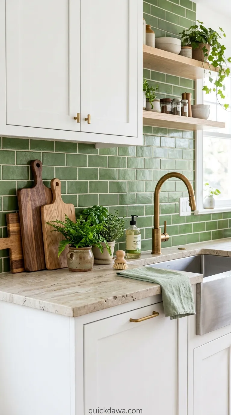
Moss green tile backsplashes against limestone countertops bring botanical beauty into hardworking kitchen spaces that need both durability and visual interest. This combination feels particularly appropriate for cooking areas because both materials reference natural outdoor environments where growth happens.
I’ve noticed that green in kitchens can increase feelings of freshness and vitality, making meal preparation feel less like a chore. The limestone provides a soft neutral foundation that allows the green to shine while contributing its own subtle textural variation and organic patterning.
Burnt Sienna and Beige
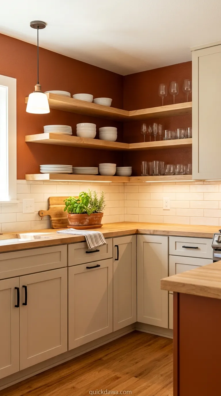
Burnt sienna accent walls paired with beige cabinetry create warmth and energy without overwhelming smaller kitchen footprints. This rich earth tone adds personality and depth while the lighter beige ensures the space doesn’t feel enclosed or visually heavy.
From what I’ve seen, this palette works exceptionally well in kitchens with limited natural light. The warm undertones in both colors help compensate for the lack of sunshine, creating a welcoming glow that makes the space feel inhabited and loved regardless of the time of day.
Charcoal and Reclaimed Wood
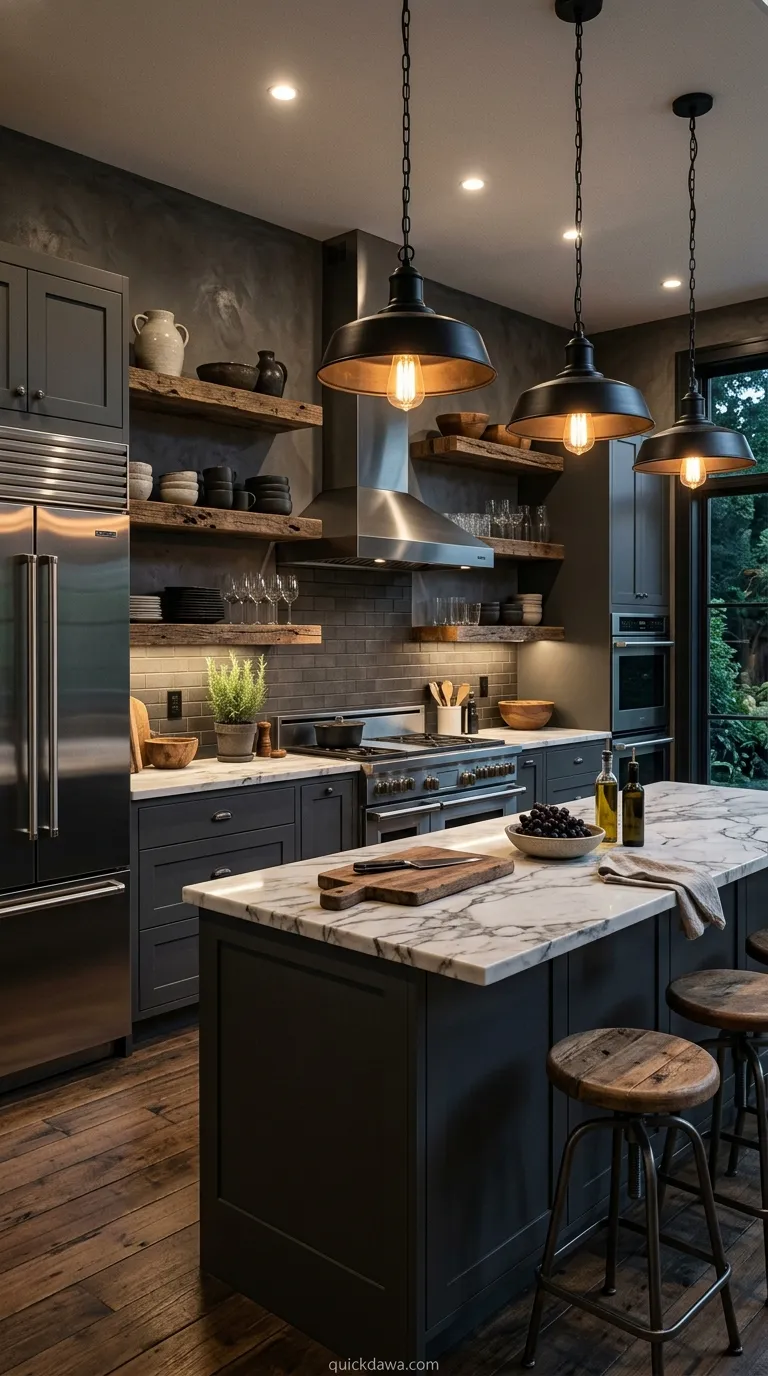
Charcoal cabinetry combined with reclaimed wood open shelving delivers an industrial-organic blend that feels current yet timeless. The dark neutral provides dramatic impact while the weathered wood introduces warmth and authentic character that only natural materials can achieve.
I’ve found that darker kitchens require thoughtful lighting planning to succeed. When properly illuminated with under-cabinet lights and pendant fixtures, this scheme creates stunning contrast and visual depth that photographs beautifully and feels sophisticated during both daytime cooking and evening entertaining.
Camel and Soft White
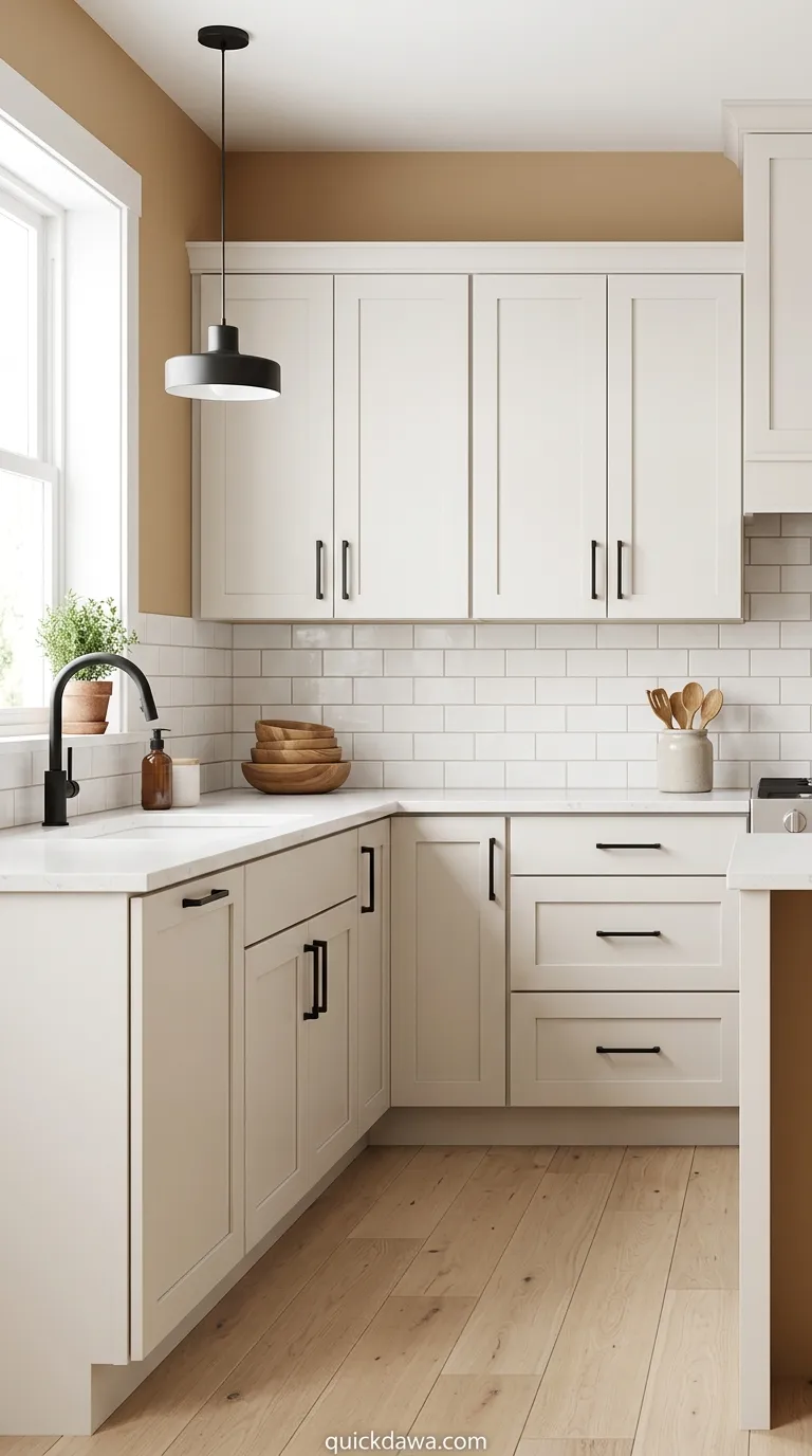
Camel-toned walls surrounding soft white cabinetry establish a light, airy neutral kitchen palette that feels warm without being heavy. This combination works beautifully in homes with modern farmhouse or Scandinavian-inspired design aesthetics where simplicity meets warmth.
The beauty of this scheme is its flexibility. You can introduce black hardware for contrast, brass for warmth, or natural wood cutting boards and bowls, and everything coordinates effortlessly because the foundation remains genuinely neutral and welcoming to various accent materials and finishes.
Forest Green and Butcher Block
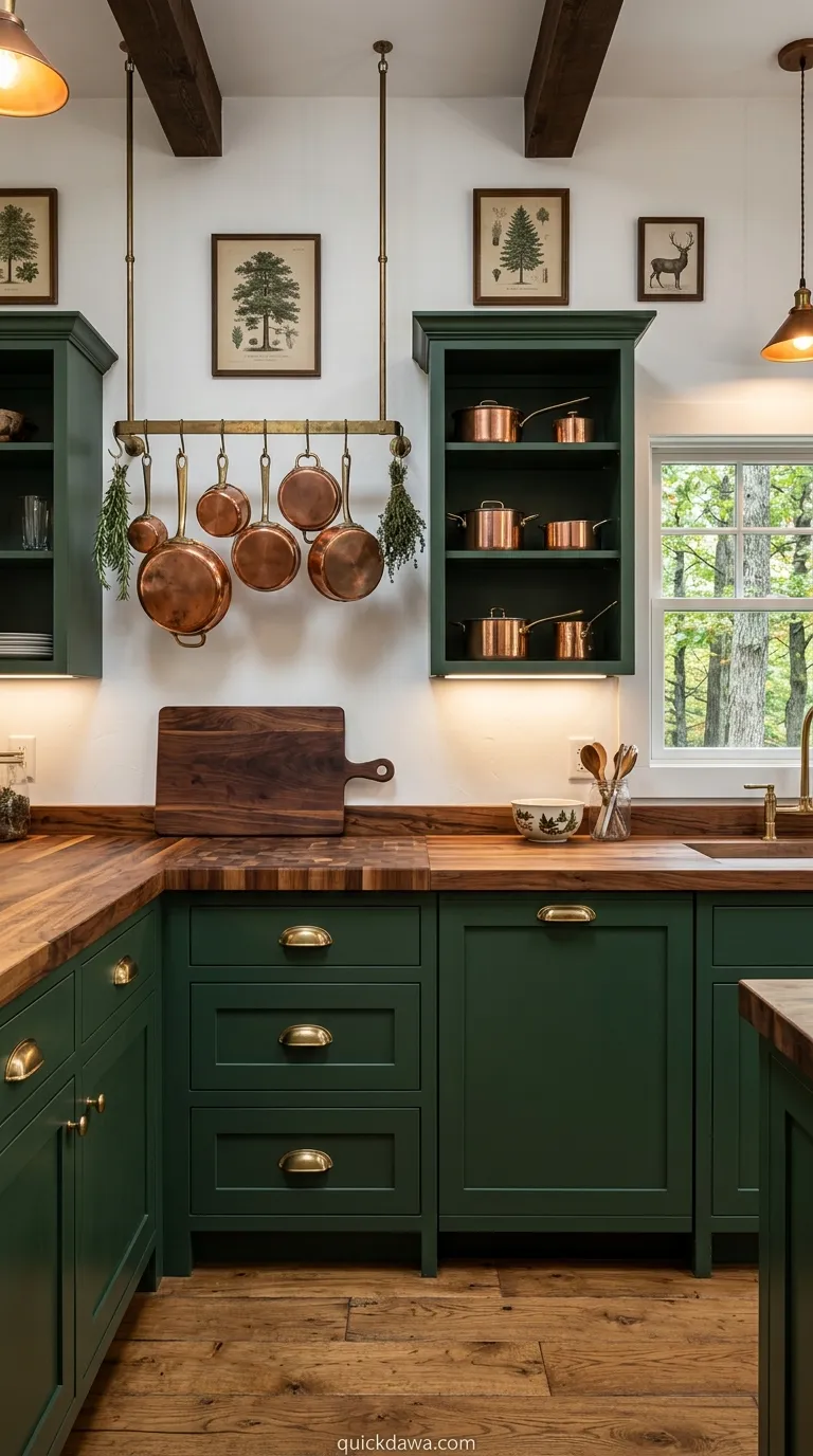
Deep forest green cabinets paired with butcher block countertops create a kitchen that feels like a woodland retreat regardless of your actual location. This nature-inspired combination brings the outdoors inside while providing practical, durable surfaces for daily cooking activities.
I’ve observed that this palette particularly appeals to those who value sustainability and natural living. Both elements age beautifully, developing character and patina over time rather than simply showing wear, which means your kitchen actually becomes more beautiful as you use it throughout the years.
Adobe and Natural Canvas
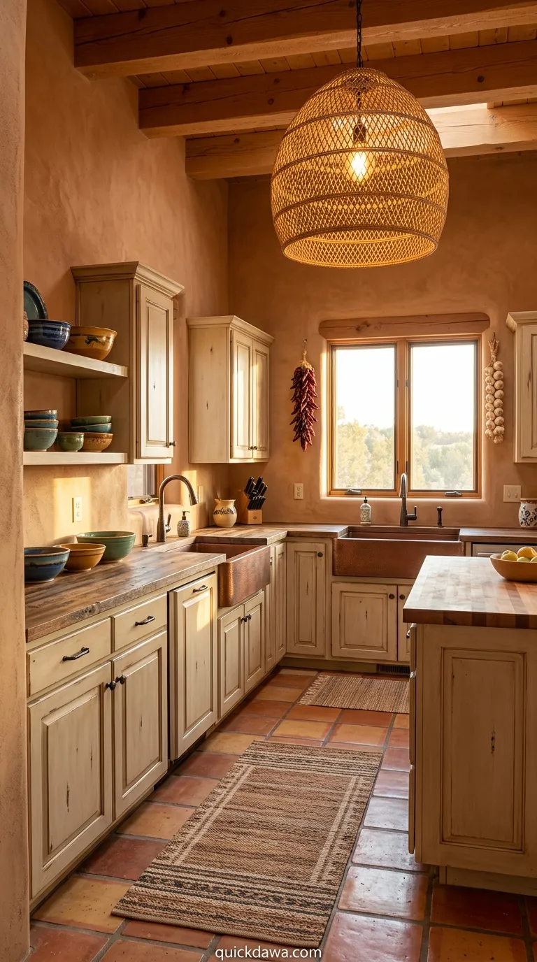
Adobe-inspired clay walls combined with natural canvas-colored cabinets deliver Southwestern warmth without requiring regional architecture. This palette creates instant coziness and works beautifully with copper fixtures, woven textiles, and ceramic dishware in complementary earth tones.
In my experience, these warm peachy-brown tones photograph exceptionally well in both natural and artificial lighting. They create a welcoming backdrop for food photography, making everything from morning coffee to dinner plates look more appealing and intentionally styled for sharing or simply enjoying.
Slate Blue-Gray and Pine
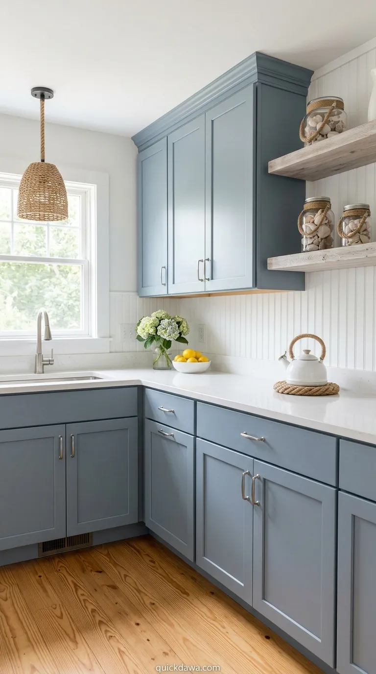
Slate blue-gray cabinetry against honey pine flooring creates an unexpected earthy color combination that feels coastal and organic simultaneously. The cool-toned blue balances the warm wood, creating visual interest without relying on high contrast or bold color statements.
I’ve seen this palette work beautifully in kitchens that receive eastern light. The morning sun warms the cool blue tones while highlighting the natural grain patterns in the pine, creating a dynamic visual experience that changes throughout the day and keeps the space feeling alive.
Wheat and Cognac
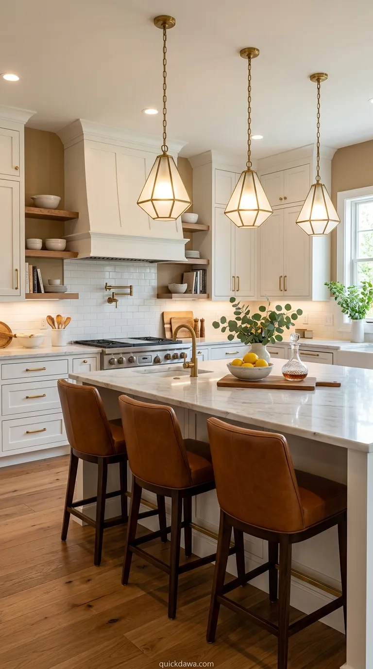
Wheat-colored walls paired with cognac leather bar stools establish a sophisticated warm kitchen scheme that feels collected rather than decorated. This palette works particularly well in open-concept spaces where the kitchen flows into living areas and needs to coordinate with upholstered furniture.
From what I’ve observed, introducing leather into kitchen spaces adds an unexpected element of luxury and warmth. The cognac tone bridges the gap between traditional brown and orange, creating richness without appearing too rustic or casual for contemporary interiors and modern lifestyles.
River Rock Gray and Cedar
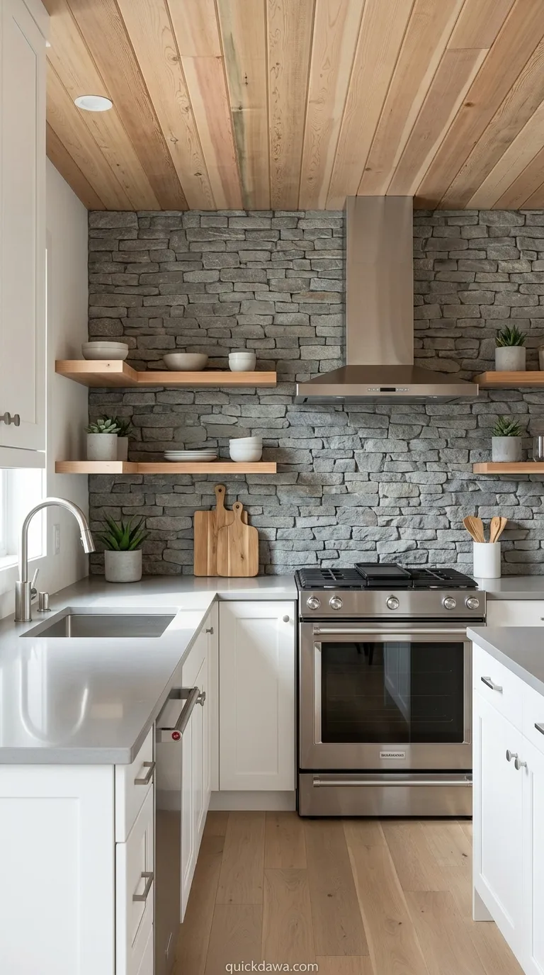
River rock gray tile paired with cedar accent walls brings the calming qualities of natural waterscapes into everyday cooking environments. This organic palette feels inherently peaceful, making kitchens less about performance and more about presence and mindful daily rituals.
I’ve found that this combination works especially well for those who want color without commitment. The gray provides a sophisticated neutral foundation while the cedar introduces just enough warmth and natural variation to prevent the space from feeling cold or minimalist in an unwelcoming way.
Conclusion
These 17 earthy kitchen color schemes prove that beautiful, functional cooking spaces don’t require bold colors or trendy palettes to make lasting impressions. From soft sages to deep forest greens, each combination offers a unique way to bring natural warmth and organic beauty into the heart of your home.
I’ve seen how these grounded palettes create kitchens that feel timeless rather than dated, welcoming rather than sterile. Whether you choose warm terracotta, calming sage, or sophisticated taupe, you’re creating a space that nurtures daily rituals and brings people together naturally.
Save this guide to your Pinterest boards for future inspiration, and start experimenting with the earth-inspired tones that speak to your personal style and home aesthetic.