21 Blue Kitchen Color Schemes That Look Expensive But Aren’t
Choosing the right color scheme can completely change how your kitchen feels. If you’ve been dreaming of a fresh, calming space that still feels stylish and modern, blue might be exactly what you need.
Blue kitchen color schemes bring a unique combination of elegance and versatility that works beautifully in any home. Whether you’re drawn to bold navy tones, soft coastal hues, or classic combinations with white and wood, there’s a blue palette that matches your vision perfectly.
I’ve noticed that homeowners often hesitate with color in the kitchen, worried it might feel overwhelming or outdated quickly. But blue has this timeless quality that adapts to nearly every design style—from farmhouse charm to sleek contemporary looks.
21 Blue Kitchen Color Schemes
In this article, you’ll explore 21 inspiring ways to incorporate blue into your kitchen through thoughtful color pairings, cabinet choices, and accent ideas. Each scheme offers a distinct mood and practical approach you can adapt to your own space, making it easier than ever to create the kitchen you’ve always wanted.
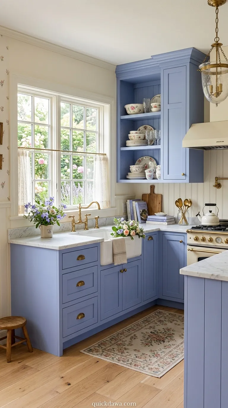
Navy and Brass Accents
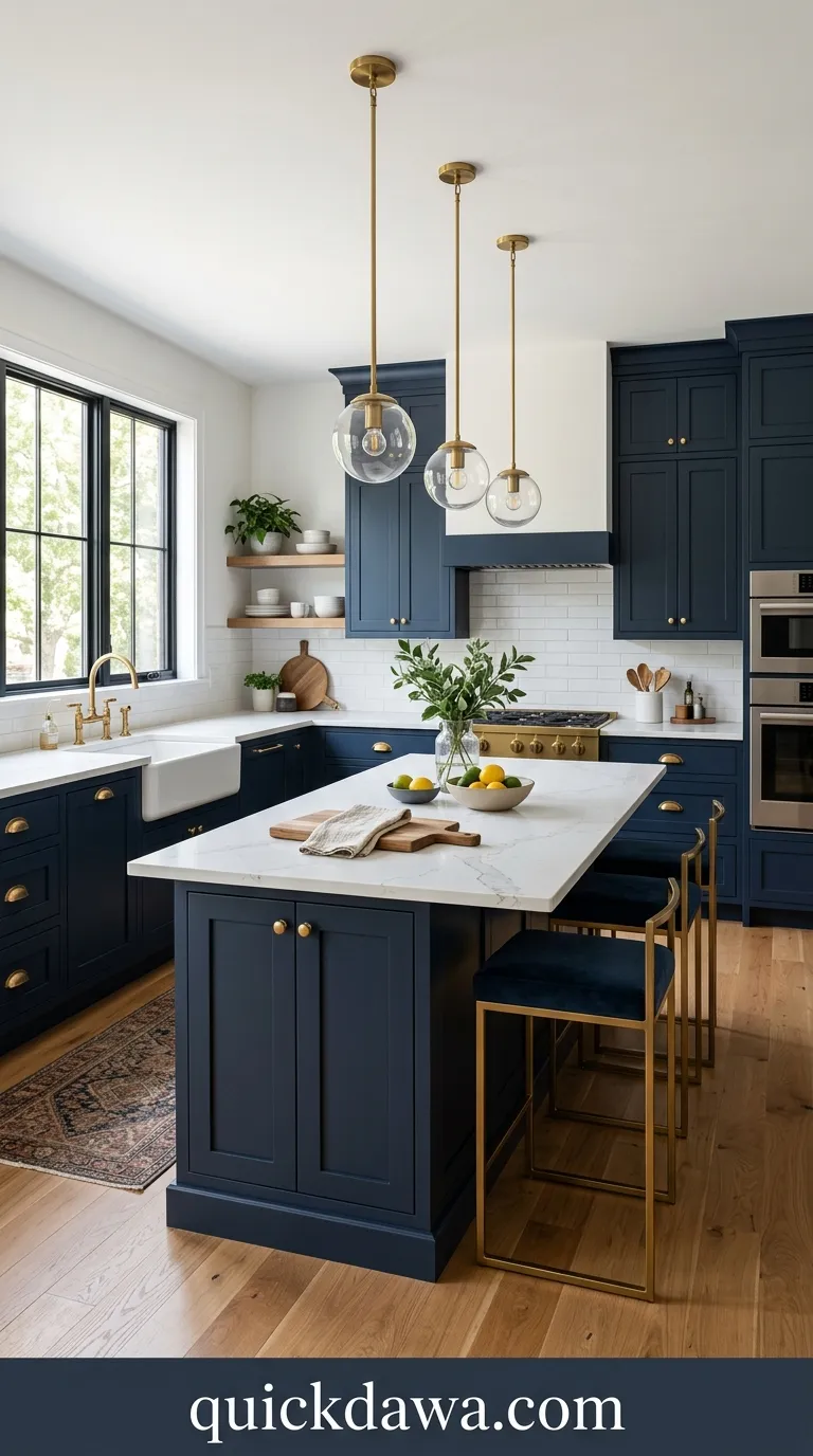
This striking combination pairs deep navy blue kitchen cabinets with warm brass hardware and fixtures. The richness of navy creates a sophisticated backdrop while brass elements add luxurious warmth.
I’ve seen this pairing transform ordinary kitchens into magazine-worthy spaces almost instantly. The contrast between cool navy and warm metallic tones creates visual interest without feeling too busy, making your kitchen feel both modern and timeless at once.
Soft Blue and White
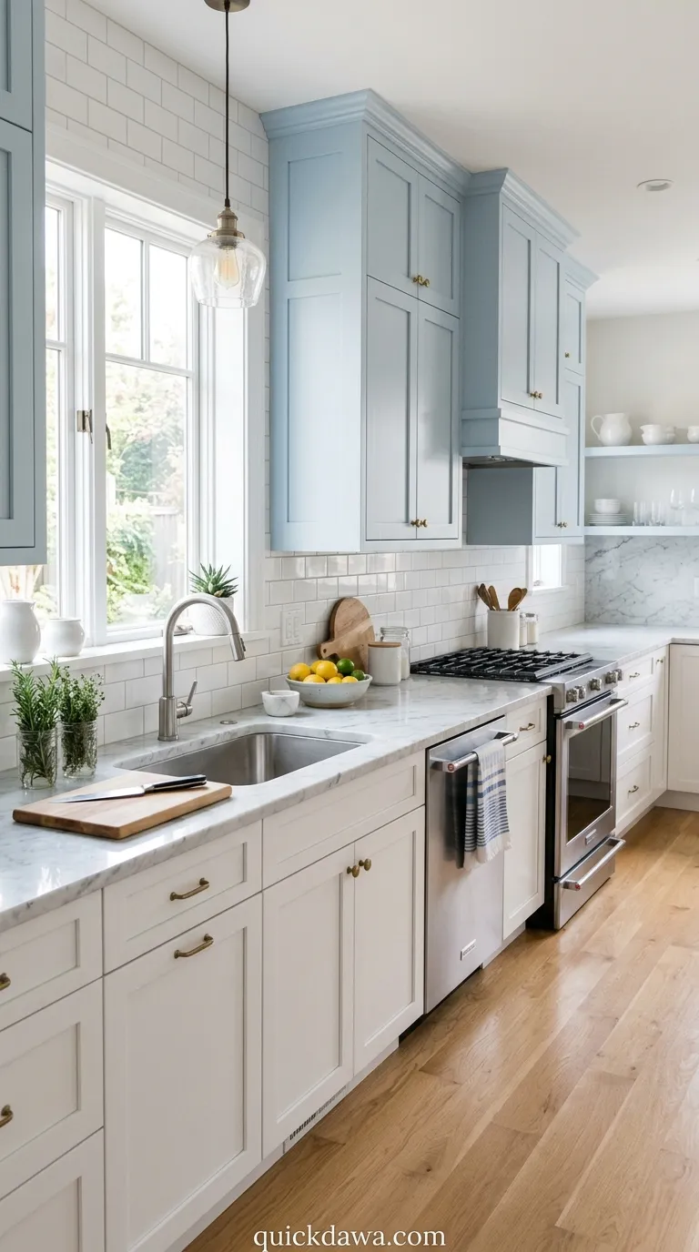
Classic blue and white kitchen palettes never go out of style because they feel fresh and airy. Light blue upper cabinets or walls combined with crisp white countertops create an open, welcoming atmosphere.
This scheme works beautifully in smaller kitchens where you want to maximize light and create the illusion of more space. The gentle contrast keeps things interesting while maintaining that clean, organized feeling everyone loves in a cooking area.
Two-Tone Blue Cabinets
Using two different blue shades creates depth and dimension in your kitchen design. Lighter blue uppers paired with darker blue lowers, or mixing blue island cabinets with white perimeter cabinetry, adds visual layers.
In my experience, this approach solves the problem of wanting color without overwhelming the space. It gives you flexibility to incorporate your favorite blue tones while keeping the overall look balanced and intentionally designed rather than one-dimensional.
Dusty Blue Farmhouse
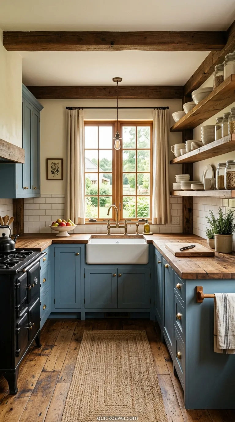
Dusty blue brings a soft, vintage quality that pairs perfectly with farmhouse elements like open shelving, wood countertops, and apron-front sinks. This muted tone feels comforting and lived-in.
I’ve noticed this shade works exceptionally well in homes with natural light because it shifts beautifully throughout the day. The gentle, grayed-down quality prevents it from feeling too sweet or childish while maintaining that welcoming farmhouse warmth.
Cobalt Blue Island
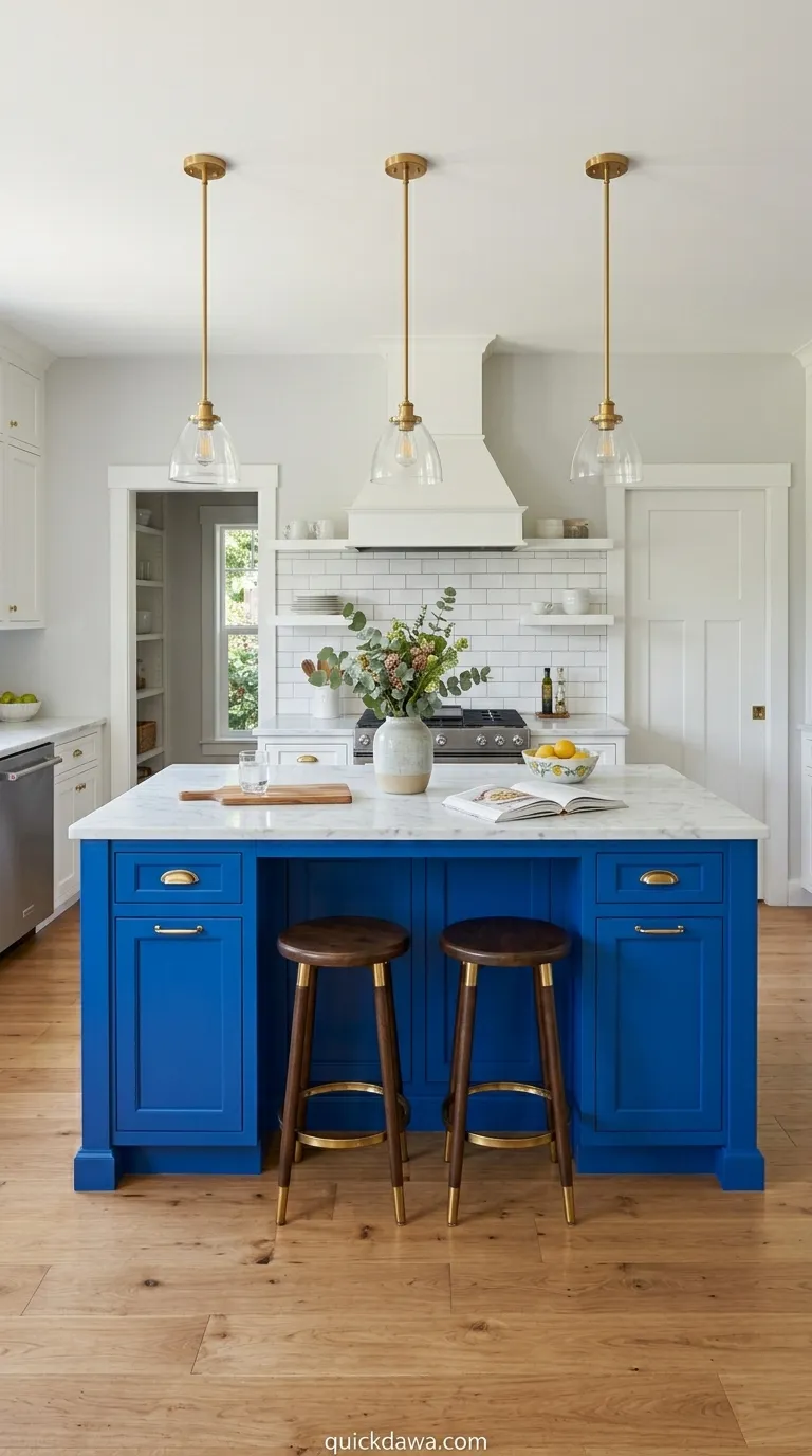
A bold cobalt blue kitchen island becomes an instant focal point while keeping perimeter cabinets neutral. This kitchen color scheme blue strategy lets you experiment with saturated color in a controlled way.
From what I’ve seen, homeowners love this approach because it’s easier to commit to color on one element rather than the entire room. The island draws the eye and creates that wow factor without requiring a complete kitchen overhaul.
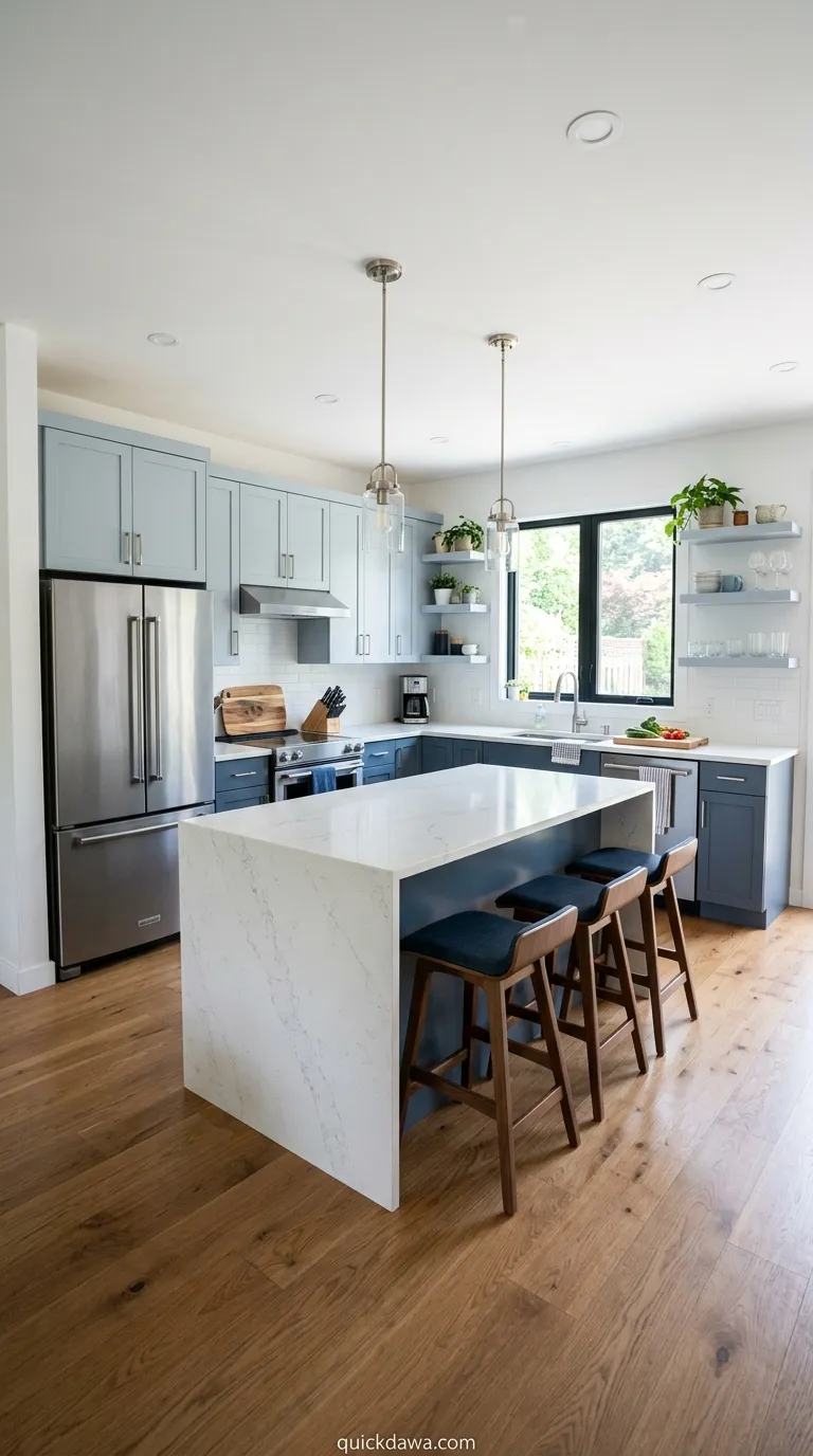
Blue and Natural Wood
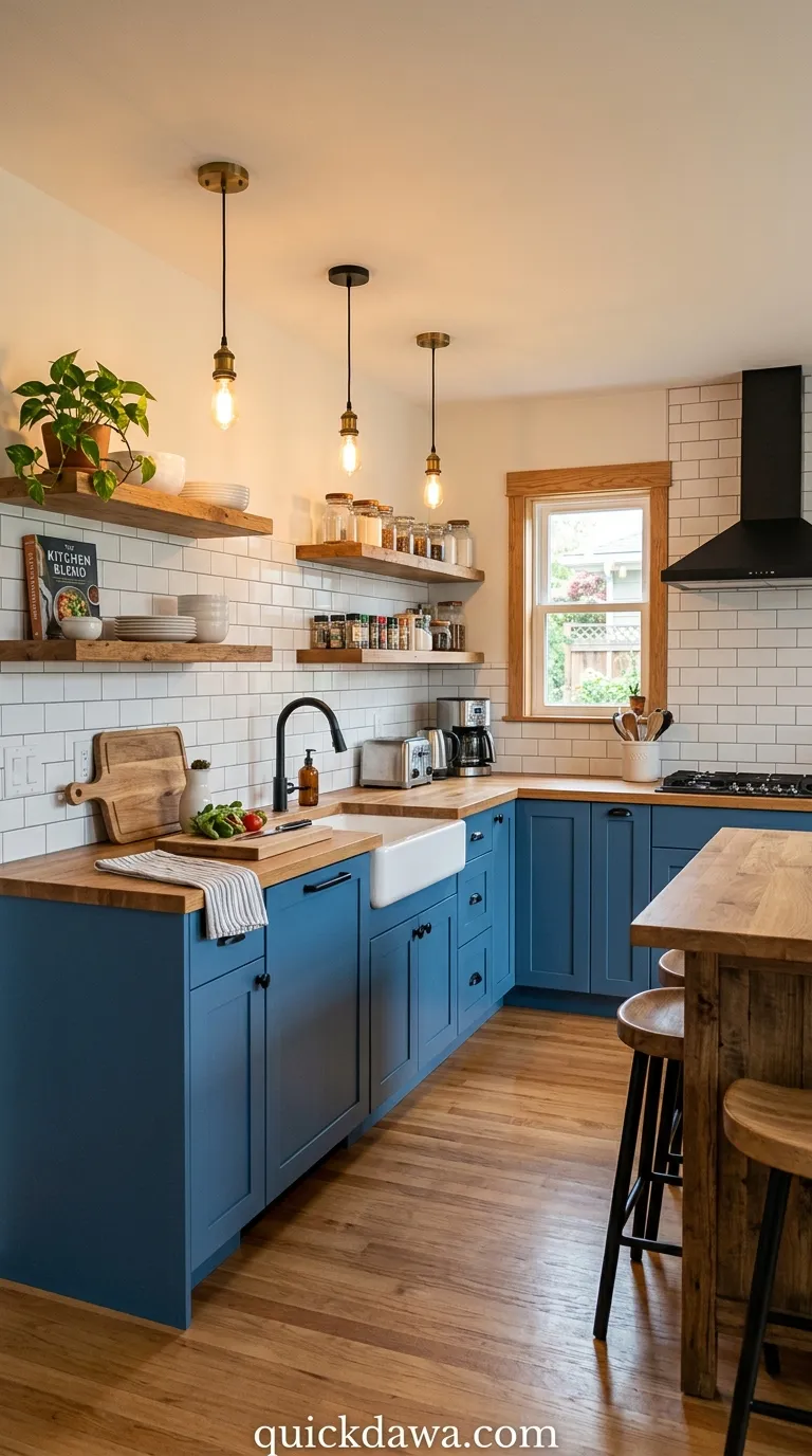
Pairing blue cabinets with natural wood elements creates beautiful warmth and organic texture. Whether through wood countertops, floating shelves, or exposed beams, this combination feels grounded and inviting.
I’ve found that wood tones prevent blue from feeling too cold or sterile in the kitchen. The natural grain and warmth balance the coolness of blue perfectly, creating a space that feels both stylish and comfortable for everyday living.
Teal and Gold
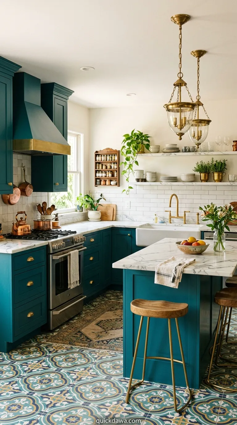
Teal cabinets with gold hardware and fixtures bring a jewel-tone richness that feels luxurious yet playful. This combination works especially well in eclectic or bohemian-inspired kitchens.
The slightly green undertones in teal make it surprisingly versatile with various materials and finishes. I’ve observed that this pairing photographs beautifully, which makes it particularly popular for those who love sharing their home on social platforms.
Pale Blue Scandinavian
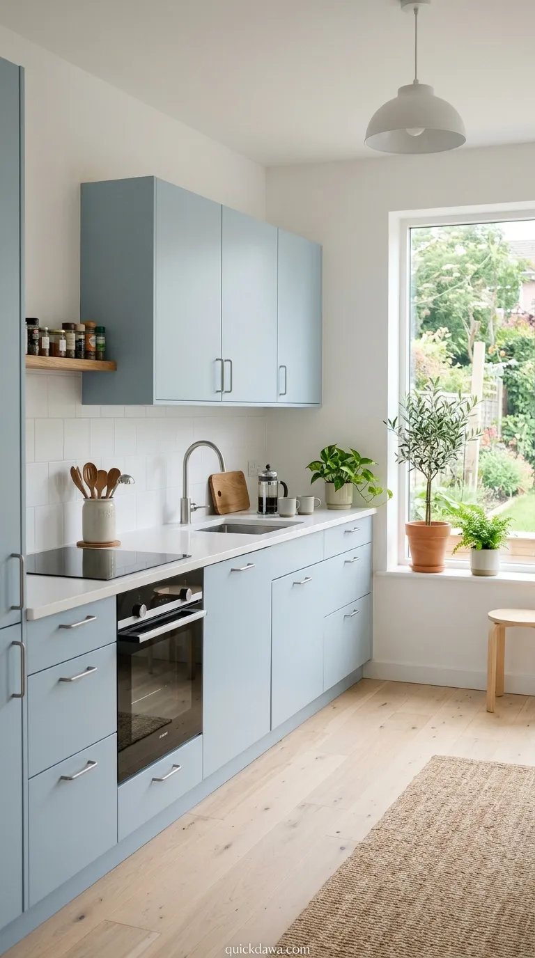
Soft, pale blue cabinetry embodies Scandinavian design principles of simplicity and tranquility. Combined with white walls, light wood, and minimal hardware, this creates an effortlessly serene kitchen.
This scheme proves you don’t need bold color to make an impact. The whisper-soft blue adds just enough personality while maintaining that clean, uncluttered aesthetic that makes Scandinavian design so appealing and functional.
Midnight Blue Drama
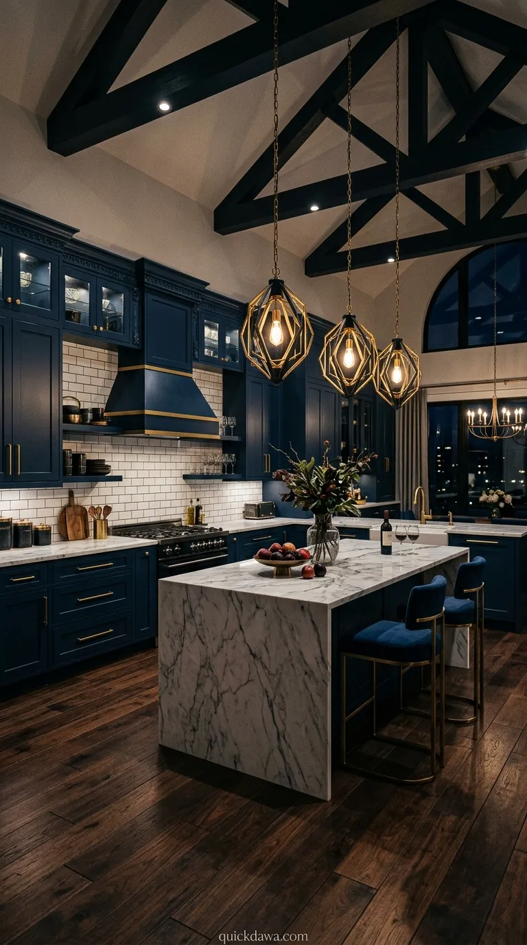
Dark blue kitchen cabinets in midnight or near-black shades create dramatic, moody interiors that feel sophisticated and cocooning. Paired with marble countertops and statement lighting, this scheme exudes elegance.
In my experience, darker blues work surprisingly well in kitchens with good lighting and higher ceilings. They create intimacy and depth rather than making the space feel smaller, especially when balanced with reflective surfaces and adequate illumination.
Blue and Gray Tones
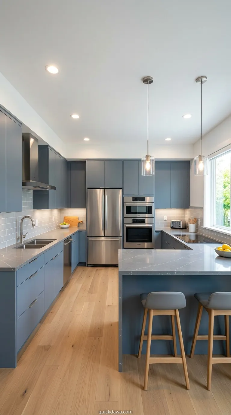
Combining blue with various gray tones creates a contemporary, sophisticated palette. Blue-gray cabinets or blue cabinets with gray walls and countertops feel modern without being too trendy.
I’ve noticed this color relationship works beautifully because both colors share cool undertones that harmonize naturally. The result feels cohesive and calming, perfect for creating that peaceful kitchen environment many homeowners desire today.
Aqua Coastal Vibes
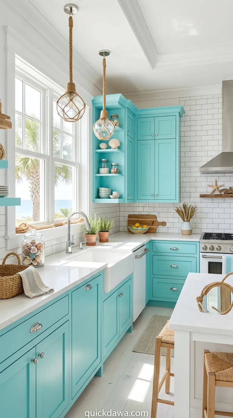
Bright aqua or turquoise brings coastal energy into your kitchen, evoking beachy, vacation-like feelings. This cheerful shade pairs wonderfully with white subway tile, natural fiber accents, and sea-inspired decor.
This scheme instantly lifts your mood the moment you walk in. From what I’ve seen, aqua works especially well in spaces with abundant natural light where the color can truly shimmer and reflect that ocean-inspired freshness.
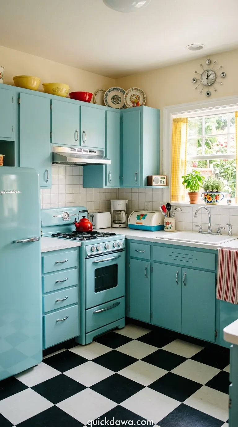
Powder Blue Vintage
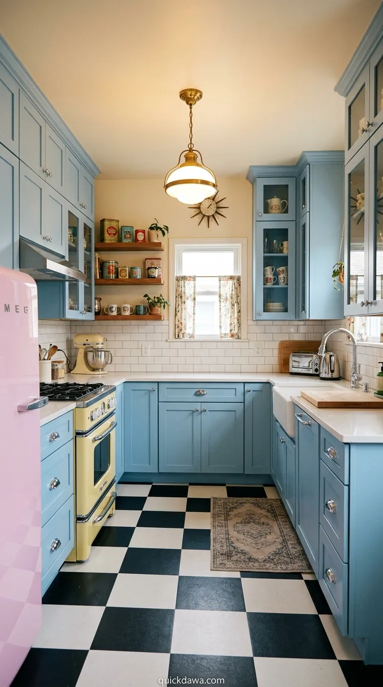
Soft powder blue cabinets create a vintage, nostalgic atmosphere reminiscent of mid-century kitchens. Combined with retro-inspired appliances and simple hardware, this palette feels charming and approachable.
I’ve found this shade particularly appealing for those who want color that feels gentle and timeless rather than bold. It adds personality without demanding too much attention, creating a background that supports your daily life beautifully.
Navy and Marble
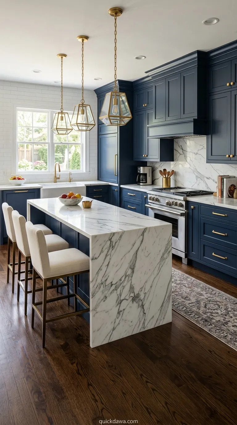
Pairing navy blue kitchen cabinets with white or gray marble countertops creates a classic, upscale look. The natural veining in marble adds organic movement against the solid, deep blue.
This combination has enduring appeal because both elements feel substantial and high-quality. I’ve observed that this pairing works across various kitchen sizes, from compact urban spaces to sprawling family kitchens, always delivering sophistication.
Blue Lower Cabinets Only
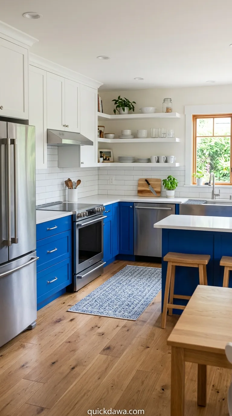
Keeping upper cabinets white or removing them entirely while painting lower cabinets blue creates an interesting visual balance. This approach keeps the kitchen feeling open while adding color where it grounds the space.
In my experience, this works particularly well in kitchens with limited upper cabinet space or where you prefer open shelving. The blue anchors the room without closing in the walls, maintaining that airy feeling.
Periwinkle Charm
Periwinkle brings a soft purple-blue hue that feels fresh and slightly unexpected. This gentle shade works beautifully in cottage-style or transitional kitchens seeking something beyond standard blues.
I’ve noticed periwinkle has a unique ability to feel both warm and cool simultaneously, making it surprisingly easy to decorate around. It pairs well with both warm woods and cool metals without clashing.
Blue Tile Backsplash
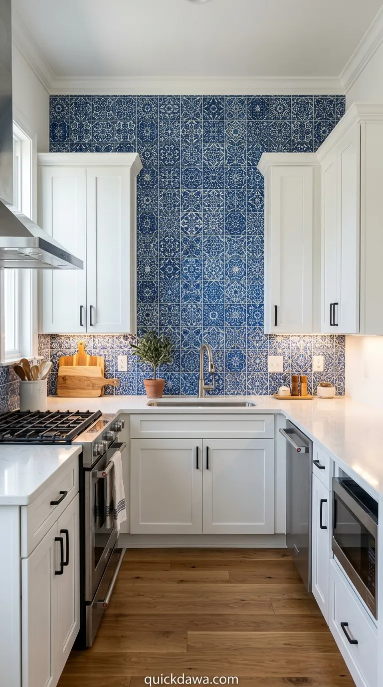
Rather than committing to blue kitchen cabinets, introducing blue through a stunning tile backsplash lets you experiment with pattern and color. This approach keeps cabinetry neutral while adding personality at eye level.
From what I’ve seen, this strategy appeals to those who love color but worry about resale value or long-term commitment. The backsplash becomes artwork that can be changed more easily than cabinetry if tastes evolve.
Slate Blue Modern
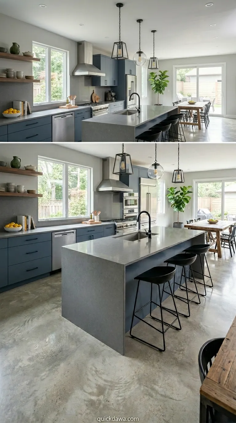
Slate blue offers a sophisticated, contemporary alternative to brighter blues. This muted, complex shade feels grown-up and pairs beautifully with stainless steel appliances and concrete countertops.
I’ve found this particular blue incredibly versatile in modern and industrial-style kitchens. It provides color without feeling overly vibrant, creating a calm backdrop that lets interesting textures and materials take center stage.
Blue and Yellow Accents
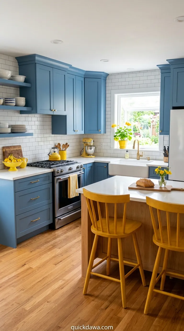
Blue cabinets paired with warm yellow accents through textiles, artwork, or small appliances creates a cheerful, energizing combination. This complementary color scheme brings visual vibrancy and personality.
In my experience, this pairing works best when one color dominates and the other appears as pops of accent. The contrast creates excitement without overwhelming the space, making your kitchen feel welcoming and lively.
Cerulean Statement Wall
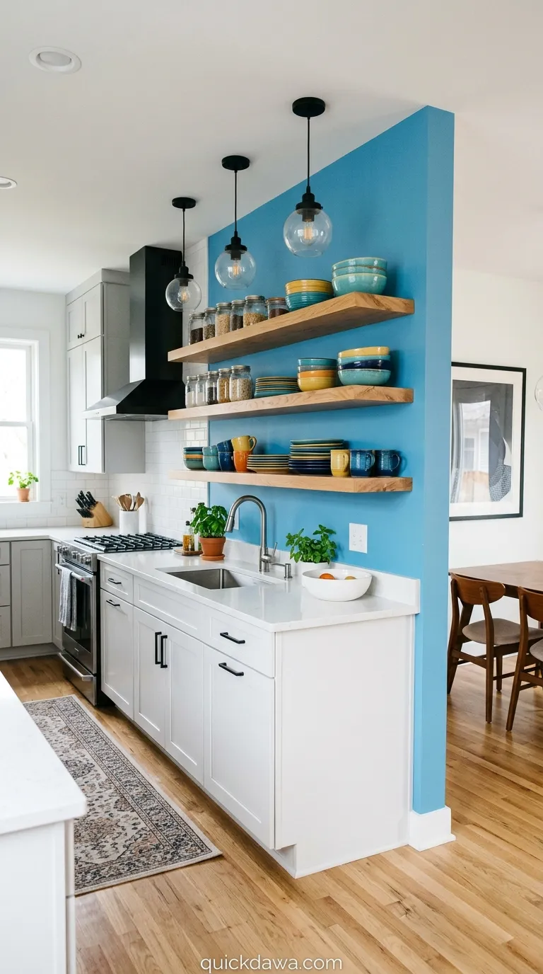
Painting one wall in bright cerulean while keeping cabinets neutral creates a bold focal point. This kitchen color scheme blue approach lets you embrace saturated color without full commitment.
I’ve observed that accent walls work particularly well behind open shelving or in breakfast nook areas. The concentrated color creates impact and defines zones within the kitchen without requiring extensive renovation or investment.
Blue and Copper Mix
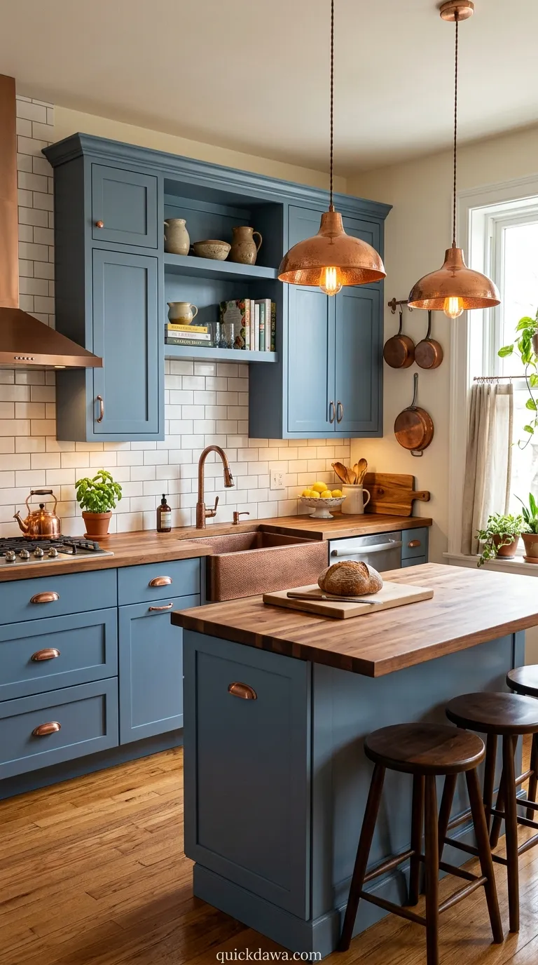
Combining blue tones with copper fixtures, hardware, and accessories creates warmth and visual interest. The reddish tones in copper beautifully complement the coolness of blue for balanced contrast.
From what I’ve seen, copper develops a beautiful patina over time that adds character and depth. This living finish paired with stable blue creates a kitchen that genuinely improves and feels more personal as it ages.
Robin’s Egg Blue
This cheerful, medium-toned blue brings optimism and energy without being overwhelming. Robin’s egg blue works beautifully in retro-inspired kitchens or spaces seeking a playful, uplifting atmosphere.
I’ve noticed this shade photographs exceptionally well and creates instant visual interest in person. It’s bright enough to energize the space but soft enough to live with comfortably, striking that perfect balance many homeowners seek.
Conclusion
Creating your dream kitchen starts with finding the color palette that truly speaks to you and fits your lifestyle. These 21 blue kitchen color schemes offer endless inspiration, whether you’re planning a complete renovation or simply refreshing your space with new paint.
I’ve seen how the right blue can completely transform not just how a kitchen looks, but how it feels to cook, gather, and live in that space daily. From bold navy statements to soft coastal whispers, there’s a blue combination waiting to make your kitchen uniquely yours.
Don’t be afraid to experiment with samples, trust your instincts, and choose the scheme that makes you excited to spend time in your kitchen. Save your favorite ideas to Pinterest, start planning your palette, and take that first step toward the beautiful blue kitchen you’ve been imagining.
Your perfect kitchen color scheme is closer than you think—sometimes it just takes a little blue inspiration to bring it to life.